rebranding temoso
- Marcela Alejandra
- May 13
- 2 min read

Updated: Aug 5
Hairpins are small, discreet, and essential in everyday life, but they often go unnoticed and are neglected when it comes to visual identity. Even though they are a classic product, most Brazilian brands adopt g eneric and purely utilitarian packaging, lacking aesthetic appeal or emotional connection with the audience. Many of these packages follow a repetitive visual pattern and lack a unique identity, resulting in a forgettable product, devoid of spirit, and disconnected from contemporary visual trends.
How can we transform Teimoso hairpins into an object chosen not only for their quality but also for their identity? How can we rejuvenate a Brazilian classic known across generations and generate differentiation, authenticity, and a desire to purchase a product that is predominantly seen as disposable?
Founded in 1962, Teimoso is a Brazilian brand that quickly stood out in the beauty market and diversified its product line, including aluminum and plastic mustache curlers, rotating hair rollers, perm paper, and more recently, curlers for afro and curly hair. This shows that the brand has remained attentive to changes in consumer behavior and the growing demand for diversity and inclusion.
Nowadays, Teimoso is still nationally recognized for its tradition, consolidating itself as one of the leading hair accessory brands in Brazil, serving both end consumers and beauty professionals.
Opting for a retro aesthetic that blends tradition and modernity, similar branding from Brazilian brands like Lola Cosmetics, Granado Pharmácias, and Nestlé’s Leite Moça were used as inspiration. Additionally, the rebranding was designed to extend beyond the packaging, encompassing store facades and other graphic materials, strengthening and consolidating the brand’s identity beyond the obvious.
Elements such as decorative fonts, faded pastel colors, and the symbolic image of a pinup create a sense of nostalgia and originality when compared to competing identities. This connects the product to current consumers who appreciate vintage aesthetics in an era where everything needs to be "Instagrammable," as well as to beauty and fashion professionals who seek not only functionality and quality but also aesthetic appeal, storytelling, and authenticity.
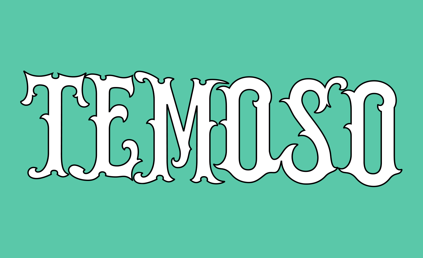
The Teimoso rebranding preserves the essence of the previous design while giving a fresh look to a traditional product, reinforcing its history and adding value to the brand. The colors follow a similar pattern to the old packaging, maintaining the aqua green and replacing the red with pink, ensuring continuity in the visual identity. The use of a black-and-white pinup as the main symbol evokes past decades, where they were seen as icons of femininity, creating a sense of legacy, nostalgia, pop culture, and tradition. The choice of an ornamental serif font was also made to reference retro packaging, the Art Nouveau style, and the brand name Teimoso, as the embellishments have an inherently rebellious look.


Comments